You’ve gently and carefully led your online shopper from the product page to checkout. You can almost taste the sale. But wait! No! Another shopper abandons a cart at checkout.
Why? While you can’t always know why people abandon their shopping cart (maybe their grilled cheese sandwich is burning), data suggests some ways you can reduce shopping cart abandonment and boost sales by eliminating these 7 checkout mistakes:
1. Forcing Users to Enter Billing and Shipping Information Separately
At least 20 percent of customers bail if you force them to type in their shipping and billing addresses separately it’s a pain for the majority of people for whom those two addresses are the same. People are busy and impatient. And while this may not seem like a huge issue for you, it can really irritate customers enough to make them leave their carts behind.
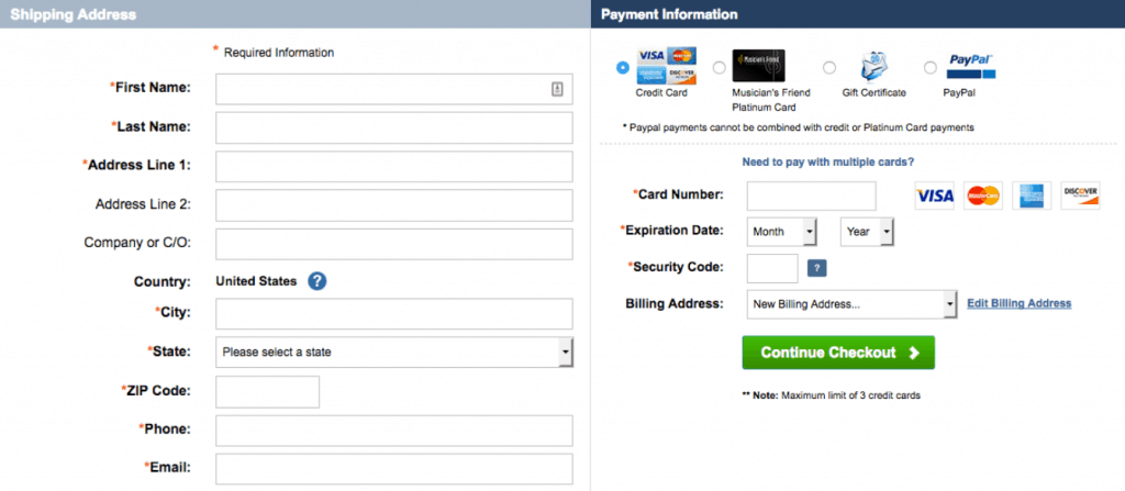
While it’s smart to offer an option to change one or the other of the addresses for customers who do have different billing and shipping addresses, make sure your checkout auto-populates one of the addresses anyway. You might win back 20 percent of your abandoned shopping carts.
2. Not Using a Guest-Checkout Feature
A little over 37 percent of cart abandonments happen at the checkout login moment. Although there are a few different reasons this might be happening, there’s one pretty big one that sticks out: requiring users to register before they can buy. Think of it from the customer’s point of view. If this is their first time shopping with you, they may be hesitant to register. They’re tired of registering for everything under the sun. Forcing them to register is a huge hassle and feels like more commitment than they’re ready for—especially if they have to remember yet another password.
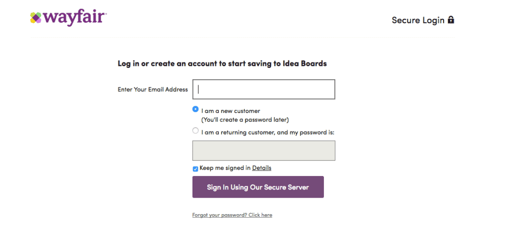
Online shoppers want an easy-to-use, hassle-free experience when they shop, so give it to them. Provide the option for them to check out as a guest. Chances are, they’ll be happier and actually complete the purchase and may consider shopping with you again.
3. Not Stressing Privacy and Security at Checkout
With online threats galloping across the world, consumers feel like they’re being watched. This fear can cool off their purchasing habits. This is why you need to make it absolutely clear to the shopper that you’ve got privacy policies and systems solidly in place to protect their data. You don’t have to panic them with huge announcements, but give them a couple of important clues on the checkout page to indicate that you have barriers in place to block criminals. Indicating that you use Secure Socket Layers (SSL) in the URL (https) and having a padlock showing protected fields or a link to your privacy policy can assuage customer nerves and help them complete the purchase confidently.
4. Too Much Distraction During Checkout
You can do a lot on pages before the checkout page to help customers through to purchase, and even to nudge them to toss a few more items into the cart before checkout. But once you get them to the checkout page, avoid any elements that distract them from completing the purchase. Display only the forms they need to get the job done.
Checkout user interface should be all about making it almost effortless for the consumer to complete the purchase. Avoid banner ads, promotions, graphics and other navigational elements until after checkout is complete. Instead, use the Thank You page for extra goodies, offers, etc. to reward them for completing check out.
5. Making it Hard for Users to Contact You
This is a problem around the web generally, but particularly on checkout pages. Imagine you’re the customer and you’re trying to checkout, but something goes wrong or you have an urgent question, but there’s no shred of contact information to help them through the process. Many customers will bail out right there. They don’t have time to wait for a return email 15 minutes or a day later. They’ve moved on.
Checkout pages with a live chat feature that provides immediate assistance, however, can help customers complete the purchase and significantly decrease the number of abandoned carts.
6. Sneaking Shipping and Handling Costs in at the End
Almost 36 percent of customers abandon shopping carts when an ecommerce site springs the shipping costs or sales taxes on them at the last moment. They hate this. It makes them feel like you are trying to pull a fast one on them, and they’ll ditch their carts.
In the interest of full disclosure, don’t wait until the last minute to tell the customer what they’ll pay for shipping or taxes. Your checkout page should calculate and label all expenses as accurately as possible to prevent nasty surprises.
7. Not Following Up with Those Who Abandon Carts
Even if you’re doing all of the previous 6 things right, you’re still going to have abandoned carts. That’s just how it is in ecommerce. But just because a customer abandons a shopping cart, this doesn’t mean you should write them off. They were interested enough to get as far as putting something into the shopping cart, and chances are, they’re still interested. Maybe they had a plumbing emergency or the dog got into the garbage again. Remarketing techniques like the abandoned cart email reminders that CartStack uses are a helpful way to bring customers back to finish their purchases. In fact, using remarketing techniques and reminders like this can bring up to 20 times the return for ecommerce businesses over companies that don’t use remarketing.
So next time a customer abandons a cart, take a deep breath. Eliminate checkout page obstacles and keep reaching out to those customers who left. With the right approach, they may well return and buy after all.
cart abandonment
Leave a Reply