Running an online business can be a rocky road, especially when you’re just starting out. It’s not easy to find customers and get them to buy from you.
The average online shopping cart abandonment rate is 69%, and you need to remember that one of the main reasons for that is how the shopping process is designed. It’s crucial to provide customers with a checkout page they have no trouble completing in seconds.
Most customers abandon their carts because they are just comparing prices online and buying things isn’t their main intention. But, Statista’s research shows that 24% of online buyers don’t complete the purchase process because they get distracted, and for 21%, the checkout process takes too long. It’s crystal clear that usability and the payment process are even more related than you think. Plus, Statista also found that in March 2020, over 88% of online shopping orders were abandoned in the U.S.
The good news is that you can improve your payment page to make customers buy from you again. Here are the most effective checkout UX practices that will turn your online business into a selling machine.
Reduce the number of steps
It seems obvious that the fewer clicks, the better, since the checkout process is quick and doesn’t require your customers to waste their time. Even though such advice is very effective, a number of merchants still seem to forget it.
Reducing the number of steps required to complete a transaction, as well as the number of form fields to a bare minimum may be a game-changer. How can you do that? For instance, create a single “Full Name” field rather than separate “First Name” and “Last Name” fields. You’ll be surprised at how quickly it will boost your conversion.
Having all the above in mind, imagine what happens when customers can pay with just one click. It’s possible thanks to payment gateways that offer the “Remember me” option, so the customer’s data are saved and it’s much easier for the next time they wish to make a purchase. So, the entire credit card payment process requires the following data only:
- Credit or debit card number
- Credit card expiration date: mm/yy
- CVV/ CVC (the number you can find on the back of your credit/debit card, usually next to the signature strip).
One of the CXL Institute’s studies shows that customers complete single-column forms an average of 15.4 seconds faster than a multi-column form. If, for some reason, you need to put a long form on your payment page, display a progress bar, so it will help customers to predict how many fields are left to complete.
Create a user-friendly design
The number of steps is a no-brainer when you set up the checkout on your e-store’s payment page, but the buying process will be more efficient when paired with a layout that fits into your entire store’s design. Online customers are more willing to buy from a company they can trust, so make an effort to create a checkout form that matches the website’s layout. It will pay off, for sure.
Keep the design clear and uncluttered to improve checkout UX and speed. For online customers, even a one-second delay in page loading speed can be a reason to close the site before completing a purchase. It’s especially important for mobile users, as it’s more difficult to go through a long and complicated process on a small screen.
Display familiar logos
To make people trust your online business more, display logos for accepted payment methods. What also can help is automatically showing the relevant logo when a customer starts to type in their card number. The card type is identified by the first digits (e.g. Visa always starts with 4 and MasterCard with 5), so it saves users time and makes payments more friendly.
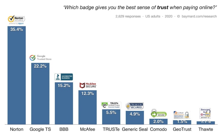
Speaking of logos, you can also add security badges to improve customer’s trust, which may come with higher conversion. The Baymard study found that people are more likely to leave the purchasing process before completing when they don’t trust the site with their credit card information. Security badges provide them with a sense of trust and the top 3 are:
- Trust seals, like Google Trusted Store
- SSL seals, issued by SSL certificate vendors
- Made up symbols, for instance, padlock icons or Secure Checkout badges.

Auto-completed form fields
It’s surprising how many merchants ask customers for information they can deduce. The rule of thumb here is: Every extra input means lower conversion. Remember and make a use of it. To make your payment process quicker and easier, use autocomplete wherever possible.
For instance, you can pre-fill the fields with a city name and state by using geo-targeting or try to detect your customer’s state from their ZIP code. Make your customer’s life easier but, at the same time, make it easy to edit the payment form if needed. If automation is used properly, it works wonders, especially for mobile users, so minimize their effort whenever possible.
Display clear error indicators
Error indicators let you show customers fields that are filled out incorrectly and tell them what should be entered to complete the process. The thing here is to give users a clear solution to help them easily understand what’s wrong. Otherwise, they are more likely to abandon their cart at checkout.
A good practice is to provide descriptions next to each field, so customers feel taken care of. Use microcopy to address errors. When the input doesn’t match, give examples of what should be typed in, but avoid messages, such as “There are some incorrect fields.” Displaying hints not only makes the online payment process easier but also reduces potential user frustration and creates a group of customers who are more likely to buy from you again.
What can also help is indicating required or optional fields, but keep in mind that an asterisk placed next to required fields it’s not that obvious for all users. That’s why putting the placeholder required (outside or inside the field) may be more effective.
Don’t hide the price
Surprises are great, but only when create great memories. That’s why you should never hide how much customers will have to pay for the product or service, including the shipping and any extra costs. For instance, you can show the overall price on the payment button, so you won’t leave room for misunderstanding.
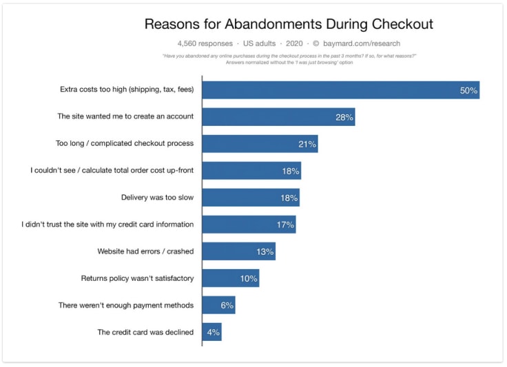
Why is that important? The Baymard Institute reports that the main reason for abandonment is extra costs that are too high. Such a mistake can cost you 50% of your customers!

Source: baymard.com
Use clear call to action
Speaking of buttons, always put a clear message on it to be sure that people understand what exactly will happen when they click on every button they see during the process. Keep it simple, there’s no need for creativity here. Bearing this in mind, this can be a simple “Pay,” so you’ll be sure that this won’t confuse the customer.
Hide a promo code box
When coupon fields are visible in checkout, people start searching for special offers over the internet, which can lead them to leave the store to find it without ever returning to your website. And what if they find better deals on your competitor’s site?
Another problem is invalid coupons, so perhaps it’s better to hide the box or use a text link without shining a spotlight on it. One piece of Statista’s research found that discount codes that don’t work is a reason for cart abandonment for 46% of online consumers.
The final advice: Meet your customer’s needs
There’s nothing like a smooth checkout flow for online buyers. One that lets them buy with ease, without any extra steps and distractions. The easier it is, the more happy customers who are more willing to return to your online store. And remember mobile customers — make the mobile shopping experience as simple as a few taps.
A no-brainer here is allowing customers to pay directly on your site. Redirections to external payment services are risky for your business — it’s a simple way to lose customers. They may get confused and frustrated, which usually results in an abandoned cart. It’s not that easy to get people to visit your website, so why would you give them ‘the opportunity’ to leave it before buying?
For online businesses, checkout is the most important part of the selling process. Find a payment gateway that offers such a solution and a checkout that can be displayed in multiple languages (chosen based on the user’s browser’s language), especially when you sell globally.
Also, use tools that will help you optimize and measure your checkout performance. Ones with a 24/7 activity tracking panel that will make it possible to analyze customer behavior, e.g. based on heat maps.
Keep in mind that the payment form is the last step of your sales funnel, so it needs to be designed with users’ needs in mind. Give your customers the best payment experience and watch your sales grow.
Is there anything else you could add to quickly improve the checkout experience?
e-commerce marketing


Leave a Reply