Estimated reading time: 7 minutes
Statistics claim that there would be 1.92 billion digital buyers in 2019. Another source reveals that US e-commerce sales will touch US$ 638 billion by 2022. That’s good news for your online business. Yet, unfortunately, not all e-commerce sites experience the same level of growth. Despite the boom in the e-commerce industry, many brands are struggling to improve their conversion rates!.
If you experience heavy traffic on your site, but the sales don’t match up, you must do something to improve your product page conversions. Most commonly, businesses try to make up for low conversion rates by focusing on abandoned carts without realizing that most customers don’t even reach that point.
Yes, that’s the harsh truth. Customers are flanked by choice in today’s digital world and are whimsical enough to make their purchase decisions based on the experience they have on your product page. But we can’t blame them, can we? With most businesses competing on experience, it is only imperative that you revamp your e-commerce product pages with your customers in mind, or lose out.
Simple Hacks to Boost Your Product Page Conversion Rate
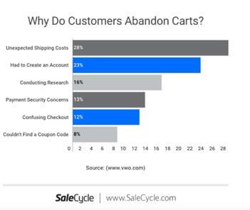
Did you know that unexpected costs, such as shipping costs, cause the maximum number of customers to abandon your site? Or, a majority of shoppers expect to see a live chat option on your website and are more likely to repurchase from a site that gives them the option to talk to an agent during the purchase?
Here’s a curated list of what shoppers expect from your product pages and how you can meet their expectations by following these seven simple steps:
1. Use a Responsive Design
Data suggests that 79% of smartphone users made an online purchase using their mobile device in the last six months.
Today, most customers prefer to shop on their smartphone or tab as compared to a desktop website. However, they expect the same seamless experience on your product pages, irrespective of the device they use. By using a responsive design for your website, you make sure that your site automatically responds to fit the device a prospective buyer is using.
In short, a mobile-first design enhances your user experience by allowing visitors to access your products across their favorite devices, without any need to resize or scroll. Besides, with Google introducing mobile-first indexing, adopting a responsive design for your product pages is no longer a choice but a necessity if you wish to remain popular and score any sales.
2. Speed Up Your Pages!
We are used to a fast life, and if your page takes longer than 2 seconds to load, over 50% of customers lose interest.
The writing is evident on the wall; don’t add to the frustration of your customers. Instead, test the speed of your product pages using a tool such as Google’s PageSpeed and make tweaks to ensure it is lightning fast.
A straightforward way to speed up a slow loading page is by optimizing the images for the web and mobile. You can use a free tool like TinyPNG to compress your images without compromising on the quality so that they don’t slow down your page.
For further reading, you can check speed up your WordPress website.
3. Integrate Live Chat on Your Product Pages
Forrester found out that up to 44% of consumers prefer the option of being able to talk to an agent while making an online purchase. A simple and inexpensive way to achieve this is by integrating live chat on your product pages so that your visitors can directly connect with your agents to have their queries solved in real-time. Acquire live chat can also be integrated with other interactive tools, such as co-browsing, audio, and video chats, enabling your agents to assist customers swiftly and conveniently.
4. Keep Testing for Best Results
Shoppers are a confused bunch. What they like today may not interest them tomorrow. That’s precisely why it is important to A/B test your offer, price, and even your layout regularly to ensure you have the most optimized version of your page on display at all times.
Unbounce is a simple tool that you can use for A/B testing various features on your product and landing pages. Use this tool to create multiple versions of a single page to see what clicks with your users and increase your conversion rate automatically.
5. Offer a Simple and Swift Checkout Process
Two things irk most online shoppers – limited payment options and no guest checkout. Starting with the latter first, it is not necessary that every buyer would be a returning one or has the time or wherewithal to create an account with you, especially if they are buying a puny item they need urgently. That’s precisely why it is best to have a guest checkout option, so that users who are in a hurry can just buy and leave.
But that’s a loss for you – you’d say – as you lose the opportunity to contact the buyer in the future. To avoid that, you can always offer a discount on signing up in addition to a guest checkout option and let the users take their preferred course. We also recommend multiple payment options, including cash on delivery, if possible, to make it convenient for shoppers to purchase on your site.
6. Say Yes to Professional Photographs
Pictures speak a thousand words, especially in the world of online shopping, where shoppers can’t touch or feel a product physically. Instead, they rely on photographs to make a choice, highlighting the importance of clear, aesthetic, and professionally clicked pictures for e-commerce product pages.
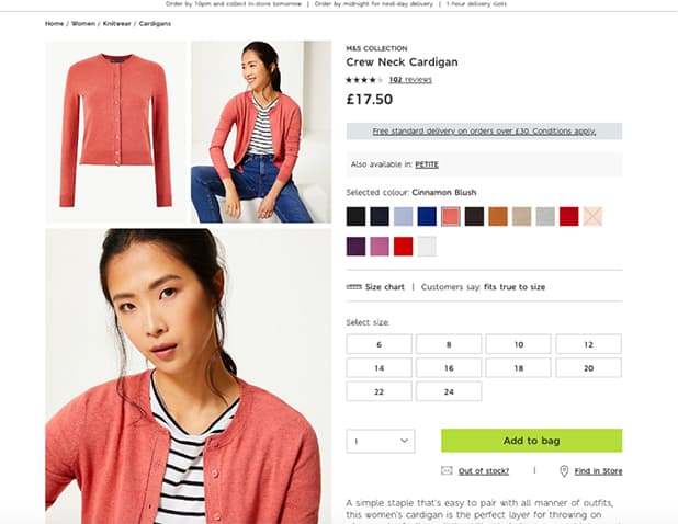
Besides using high-quality pictures of the same size and quality, it is recommended to use multiple photos of a product to acquaint the prospective buyer with every corner of the product, literally. Stats confirm that up to 33.16% of customers prefer to view multiple images of a product before making a purchase. This includes showcasing the variations of colors available in a product as opposed to a small tab listing the options for users.
Another great idea to help shoppers make a choice involves the use of 360-degree videos that enable a better understanding of your products. Data upholds this suggestion by indicating 64% of shoppers are more likely to purchase a product after viewing a video.
7. Improve Your Copy
As we mentioned before, the product photography is one of the most critical factors in determining the success of your product pages. However, it is not the only one. Despite the fact that internet users prefer visual cues, content is king when it comes to e-commerce, and improving your copy can potentially boost your conversions significantly.
The reason is simple – while visitors can’t physically see or feel your products, they want to know more before making a purchase. This can be done by using a compelling and informative copy that answers their queries and helps them make a quick purchase decision.
But how do you define ‘good copy’?
Well, a good and effective copy is not just meaningful and engaging but also stays clear of large or complex vocabulary, tacky sentences, and long phrases. Here are some tips for structuring your copy for maximum conversions:
- Keep your product descriptions crisp, meaningful, and creative.
- Follow a clear structure with headings and bullet points for easy reading.
- Include specific details about products to create informative copies.
- Make use of proper keywords to optimize your product pages.
- Place your content in an ‘F’ pattern for quick reading.
- Make use of words that evoke strong emotions, such as stunning instead of great.
In addition to the above, don’t forget to list the price, shipping charges, and any additional costs with the copy. It is a fact that very few e-commerce websites display shipping costs and VAT/GST charges transparently on their product pages. Consequently, visitors are often shocked to see an escalated price when finalizing their order and end up abandoning their cart in most cases. By listing any additional costs, transparently and prominently, you can win your customers’ trust and avoid any unpleasant experiences. Of course, if you can offer free shipping, that will make the deal sweeter for your visitors, and you will certainly see a positive impact on your conversion rate.
To Conclude
The
seven steps outlined above will certainly boost your product page conversion
rate while elevating your customer experience considerably. Is there anything
else you’d like to add to the list or share regarding any of the strategies
mentioned above? Spread the knowledge by sharing your experiences and views in
the comments section below.

Did you know that data has shown that adding 360 product photography to your product page can increase conversions by as much as 50 %!